

SAVERY
PROJECT INFO
Project Background
Canada’s grocery prices have skyrocketed over the past few years. This is due to many factors, such as COVID-19-related food supply chain disruptions, labour disputes, climate change, and geopolitical issues. Because of this, Canadians (especially low- to middle-income ones) have had to adopt new habits to cope with these increases. Savery is an app that suggests meal ideas to users by basing its recipes on ingredients currently on sale, saving them time and stress doing all the mental calculations.
Target Audience
The target audience is low- to middle-income Canadians (including all ages and demographics ranging from students to parents), people wanting to save some extra money, and health-conscious people.
Project Objectives
To develop a modern and user-friendly app to allow people to plan meals easily.
Thesis Statement
Despite support from food banks, low- and middle-income Canadians continue to struggle to afford healthy food. An app that generates cost-effective and nutritious meal plans based on weekly grocery store discounts could help alleviate both financial and mental strain.
Disciplines
Branding, UI/UX, Advertising
Date
2025
Tools & Platforms
Adobe Illustrator, Photoshop, Figma

VISUAL IDENTITY
The visual identity was designed to be modern yet soothing. A green colour palette was chosen to have a calming effect on the target audience, who are probably stressed and financially burdened. Green is also chosen for its psychological ties with money. “Inter” was chosen for the typeface for its highly legible letterforms and for its popularity in app designs. The app uses rounded corners for a friendly feel. Dark blur overlays are also part of the branding for a modern and glassy look. The icons are sourced from Google Icons for consistency and familiarity.
GRAPHIC TOOLBOX
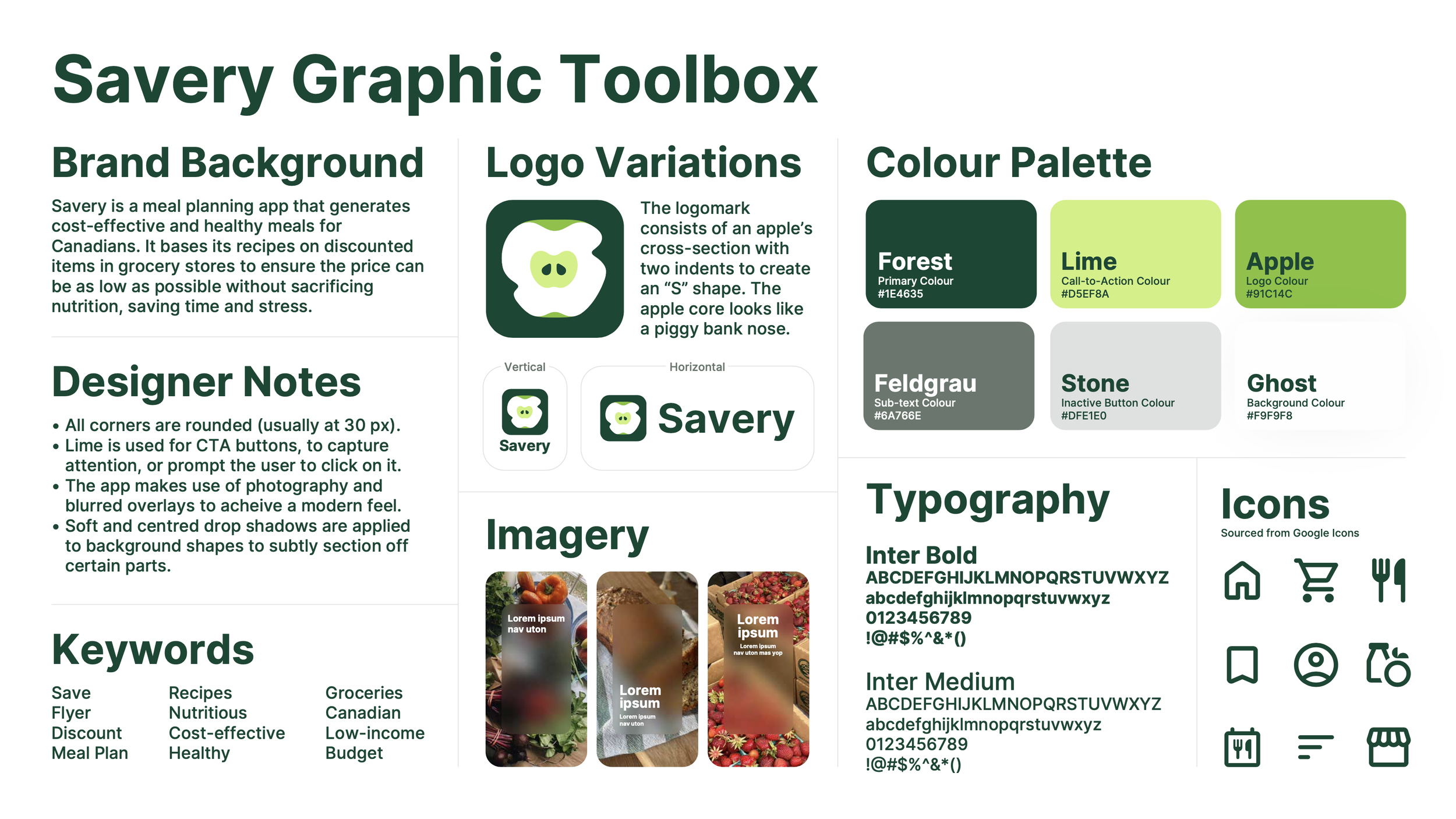

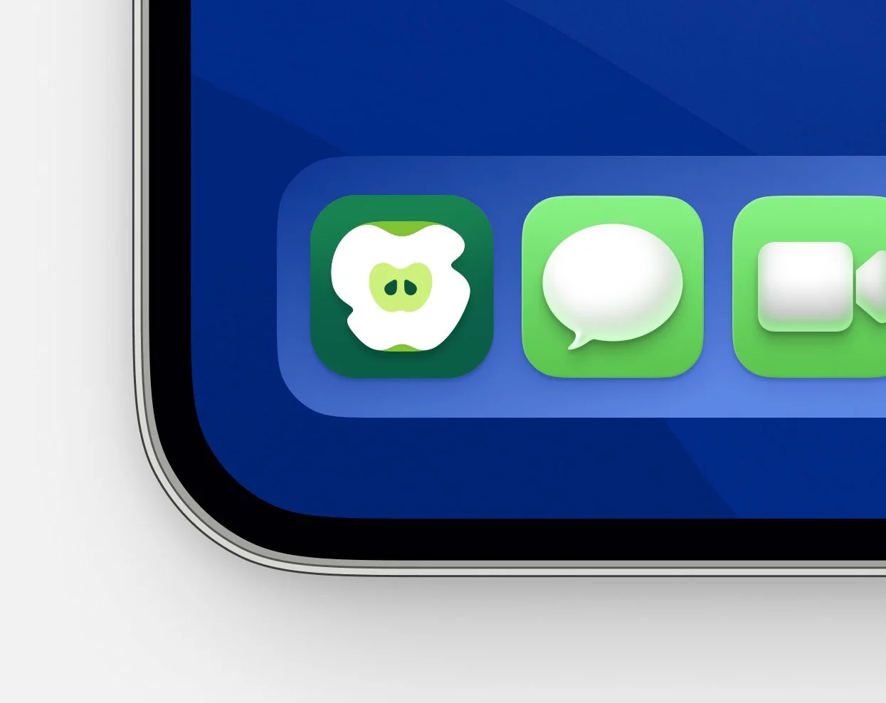
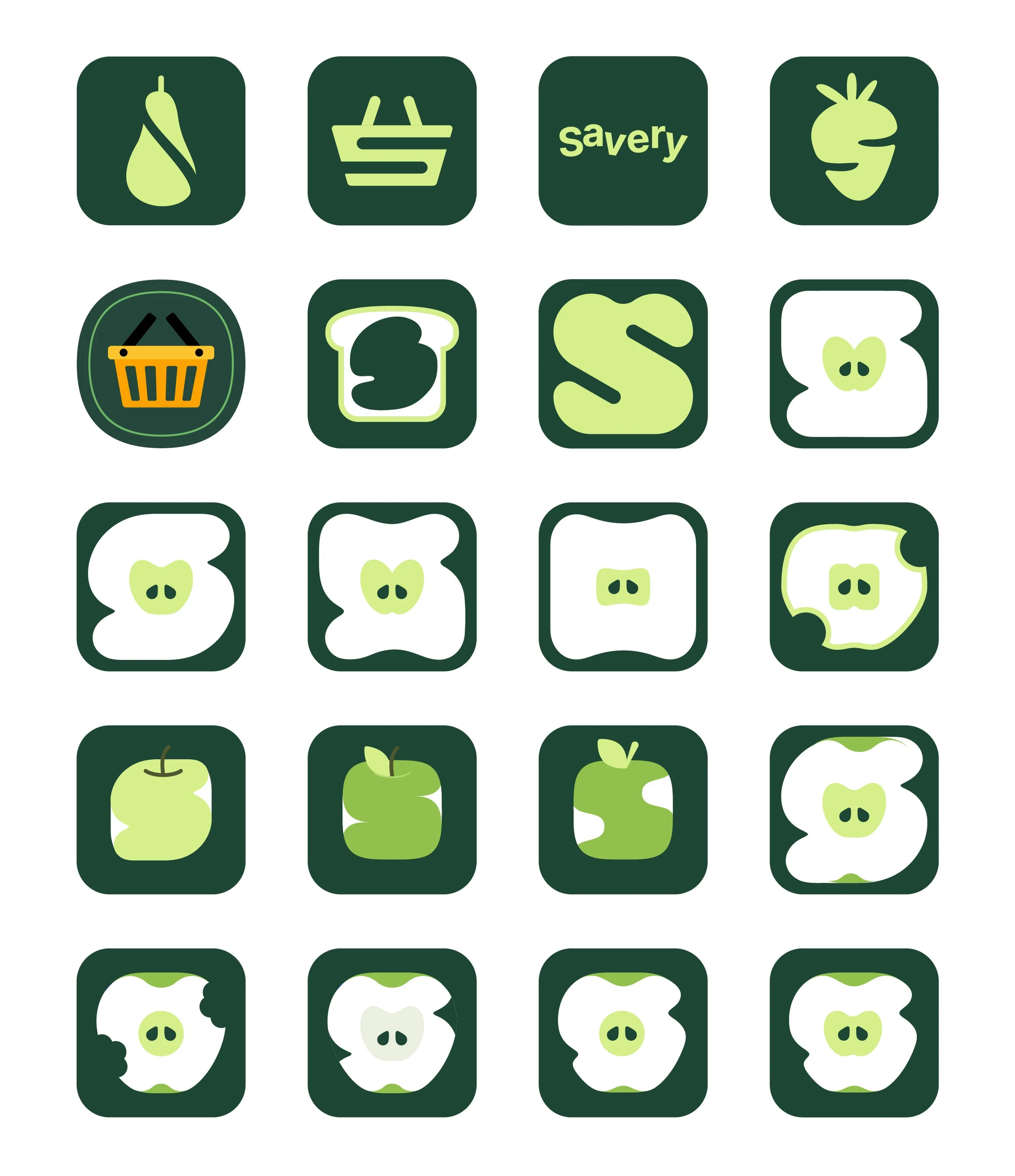
The logo is a cross-section of an apple with two notches to make the overall shape look like an “S” for Savery. The apple’s core can also be interpreted as a piggy bank nose to allude to money and budgeting. The company name is a blend of “save” and “savoury.”
LOGO DESIGN

I explored multiple logomark ideas, all revolving around the letter S, grocery shopping, and food, ranging from carts and baskets to produce.
PROCESS

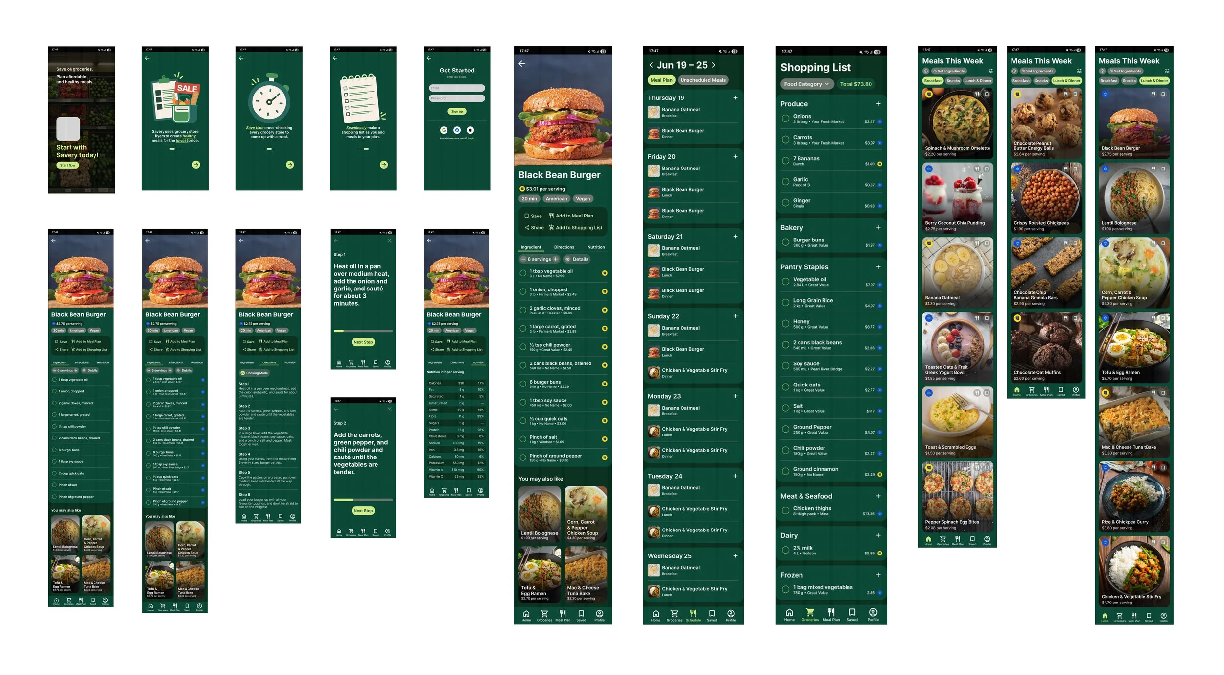
APP INTERFACE
The app greets the user by explaining how it will help them, building excitement and eagerness. It then asks them several questions to customize their experience. To best suit their needs, the app inquires about their allergies, dislikes, favourite grocery stores, postal code, and weekly budget.
The user is prompted to click next with the CTA button colour — lime.
01. ONBOARDING
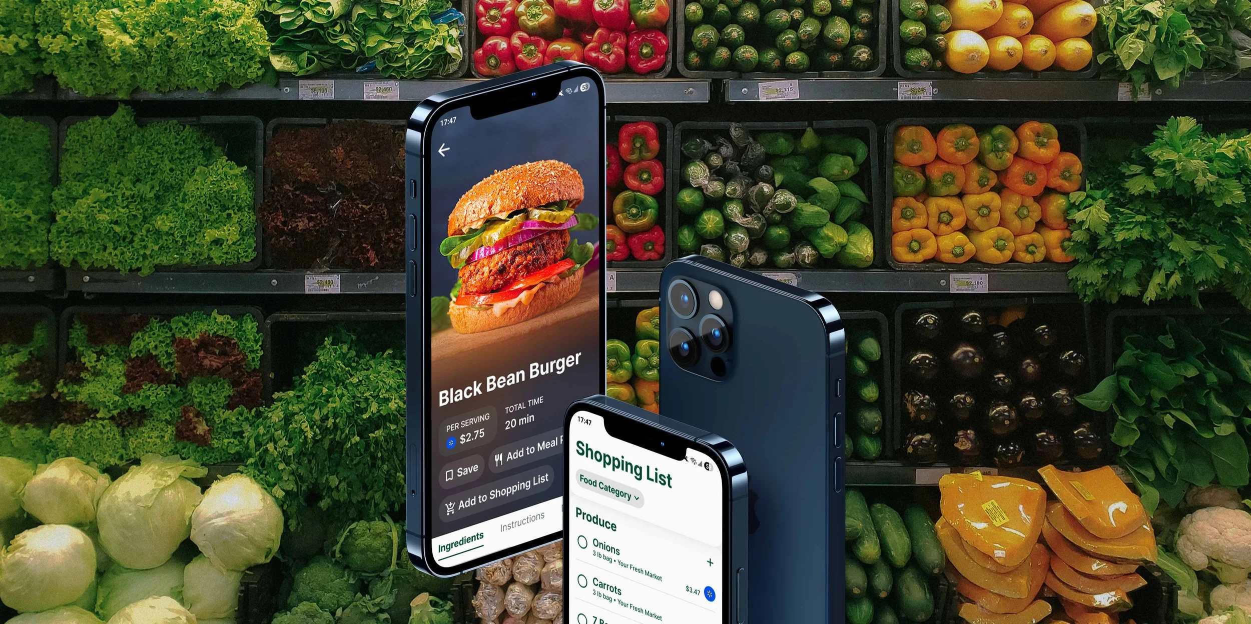
The homepage is divided into three pages based on meal types: Breakfast, Snacks, and Lunch & Dinner. Each recipe card has information such as:
Name of the dish
Price per serving
Grocery store the ingredients are cheapest at
Two quick-access buttons to add to the meal plan and to the saved collection.
To continue the modern feel, a dark blur gradient is applied to the bottom of each recipe card to make the text on top more legible.
The “Set Ingredient” function is especially useful if users want to incorporate ingredients for which they are getting points at their grocery stores. For e.g. here, if the user gets a PC Optimum offer where they receive 100 points for the purchase of eggs, they can add it to the “set ingredients” to make sure they are maximizing their savings.
02. HOMEPAGE
The recipe page landing page has a few key information/buttons such as:
Price per serving
Total time to make the meal
Add to saved collection
Add to meal plan
Add to shopping list
The page is separated into three sections: Ingredients, Instructions, and Nutrition for easy navigation. The ingredients page has the option to change the serving number and other meal suggestions at the bottom to keep the user engaged.
The Instructions page has all the steps clearly laid out with a “Cooking Mode” button. When clicked, the app displays each step in large text with a progress bar to allow the user to follow the recipe more easily.
Finally, the Nutrition page gives the user a snapshot of each serving’s macros to ensure that the recipes are, in fact, healthy.
When adding to the shopping list, a list pops up with most of the ingredients pre-selected, with the exception of a few pantry staples that the user has the ability to add if they’ve run out. When clicking on the grocery store logo, the user can compare the price per serving in each store to fit their schedule, preference, or needs.
03. RECIPE PAGE
Meals that were added to the meal plan get queued in the “Unscheduled Meals” tab, which the user can then decide when to schedule these meals for. When adding a new meal, the pop-up list gets updated to let the user know which meal has already been planned.
04. MEAL PLAN
The shopping list can be sorted in three ways:
Food category
Grocery store
Price
Discounted items are highlighted to let the user know at a glance. Each item has the grocery store from which to buy it on the side. When clicked, the item’s price can be compared across stores, and the user can choose their preferred one.
05. SHOPPING LIST
Users can save both their favourite meals and ingredients, for which they can get notifications whenever there are sales happening. The app also suggests ingredients the user might want to save.
06. SAVED
The profile page allows the user to change any preferences set at the onboarding stage. Icons are used throughout for easy recognition.
07. PROFILE

I started by sketching out some low-fidelity wireframes to jot down screen ideas, which changed a little as I went further in the design process.
PROCESS
The medium- to high-fidelity wireframes initially had a dark green background for the branding. However, after consideration, the final screens were changed to an off-white for more airiness and modernism. This change allowed for the food to look more appetizing, have a cleaner layout, and be more accessible.
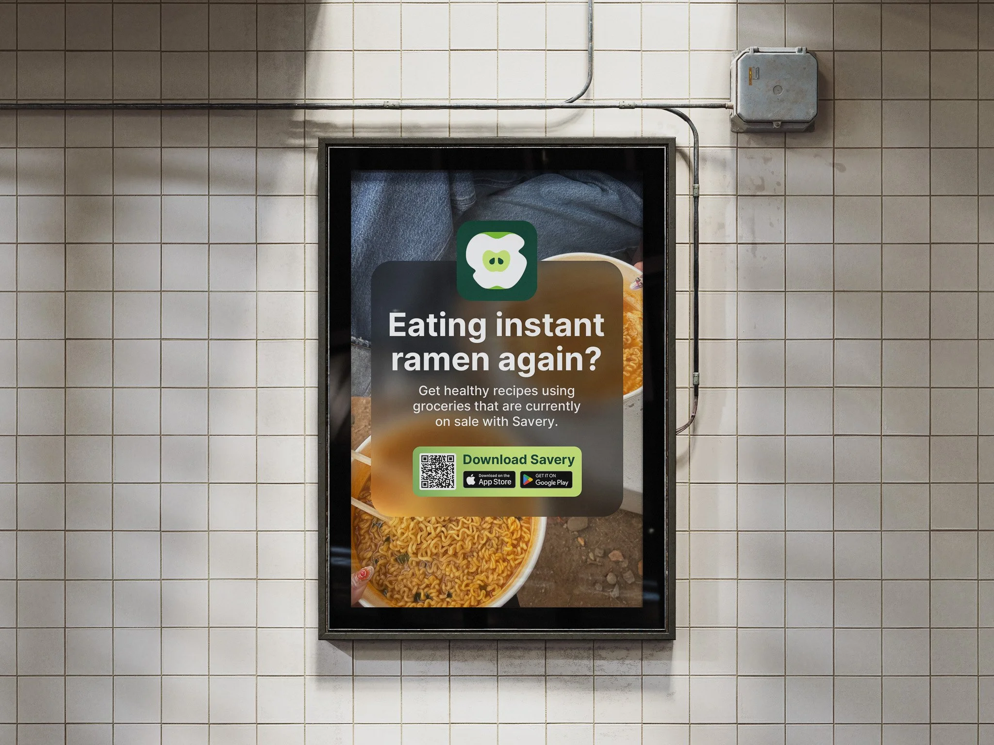
PROMOTIONAL MATERIAL
The bus shelter ad uses the same dark, blurry overlay for brand cohesion and to make the ad look like a notification pop-up, with the lime colour being used as the CTA. A large portion of the target audience probably uses public transit as funds are limited.
01. BUS SHELTER AD

This ad follows the same system as the bus shelter ad for cohesion. The copy is cheeky and mainly appeals to students.
02. SUBWAY STATION AD
The social media posts vary in content, from highlighting the budget recipes provided by the app to pure advertising. To provide value to prompt people to follow, the account could post content such as “Tips to save on groceries” or other educational or fun posts to keep the audience engaged.
03. SOCIAL MEDIA POSTS


FUTURE STEPS
In future iterations of the app, more features could be potentially incorporated, such as:
The ability to cater to certain diets, such as keto, paleo, vegan, etc.
The ability to track macros or set calorie and protein goals.
The ability to track pantry and fridge inventory.
The ability to choose preferred cuisines.
The ability to choose to only buy from Canadian brands.
The possibility of having users interact with each other and share tips and photos.