
SALT MINE CREAMERY


Project Background
Salt Mine Creamery is a new, small gluten-free ice cream company based in Goderich, Ontario.
Project Objectives
To develop a dynamic visual identity, packaging sticker labels, and cart decals.
Problem
The company is launching for the first time in the summer of 2025 and needs a brand identity to establish a cohesive presence online and in markets. The brand is very small and local. Everything is handmade. They would like branding that reflects their origins (Goderich) and artisanal craft, targeting Millennials to Senior individuals, most of whom have children. Evoking a coastal ambiance was important to the client since they are located in a beach town.
Disciplines
Branding, Packaging
Date
2025
Tools & Platforms
Adobe Illustrator, Photoshop
PROJECT INFO

VISUAL IDENTITY
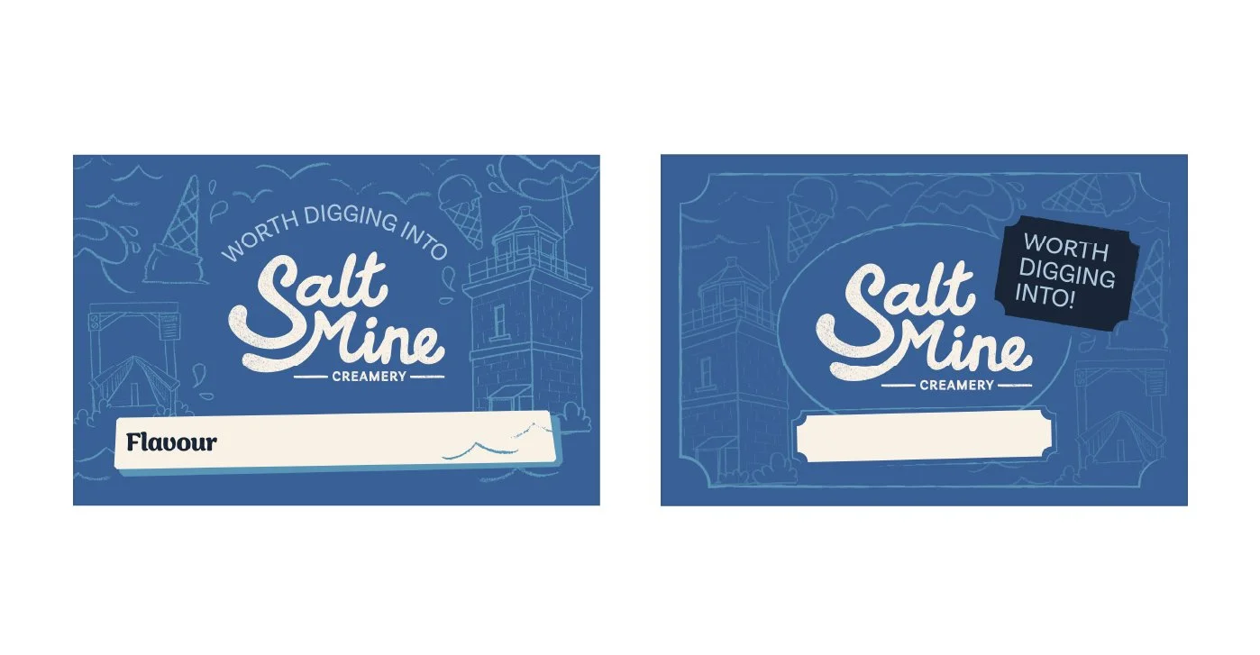
The visual identity was designed to communicate the small scale and artisanal nature of the brand, as well as its coastal location. The client primarily wanted blues in the colour palette with a retro feel. Throughout the identity, I included rougher textures to convey the Goderichian salt mines and the brand’s handmade production process.
The logo is a wordmark with a translucent, grainy texture, reminiscent of salt and sand. The letters interlock nicely, bringing a dynamic and wave-like quality to the connection with Goderich. The typeface is a custom script with rounded letterforms to appear friendly and playful. “Creamery” is rendered in a more structured sans-serif for balance.


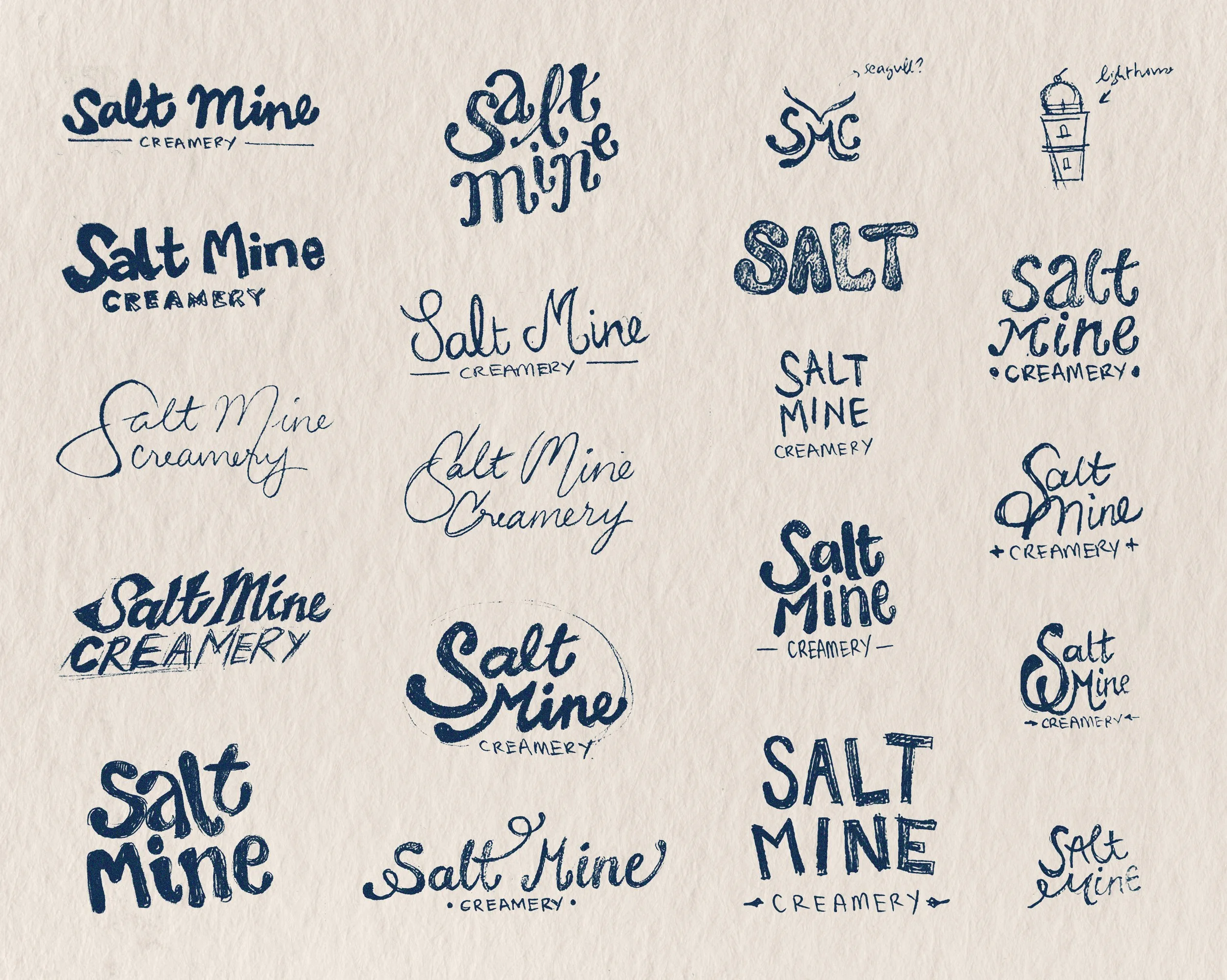
The client wanted a wordmark for the logo. I started out by sketching various letterings, each with their own personality. A few colour explorations were also done before we finalized on a design. The final design was chosen as it strikes a balance between youthfulness and professionalism.
PROCESS

PACKAGING LABEL
Keeping the coastal theme in mind, the packaging labels were made to have a postcard look. The frame with the hand-drawn illustrations of local landmarks around Goderich echoes the brand’s artisanal nature and production. Since the brand was still young, funds were limited, so we designed a universal label with the ability to handwrite each ice cream flavour. This allowed for initial brand awareness to the local population, communicating its tagline and positioning itself as the go-to artisanal Goderichian gluten-free ice cream.
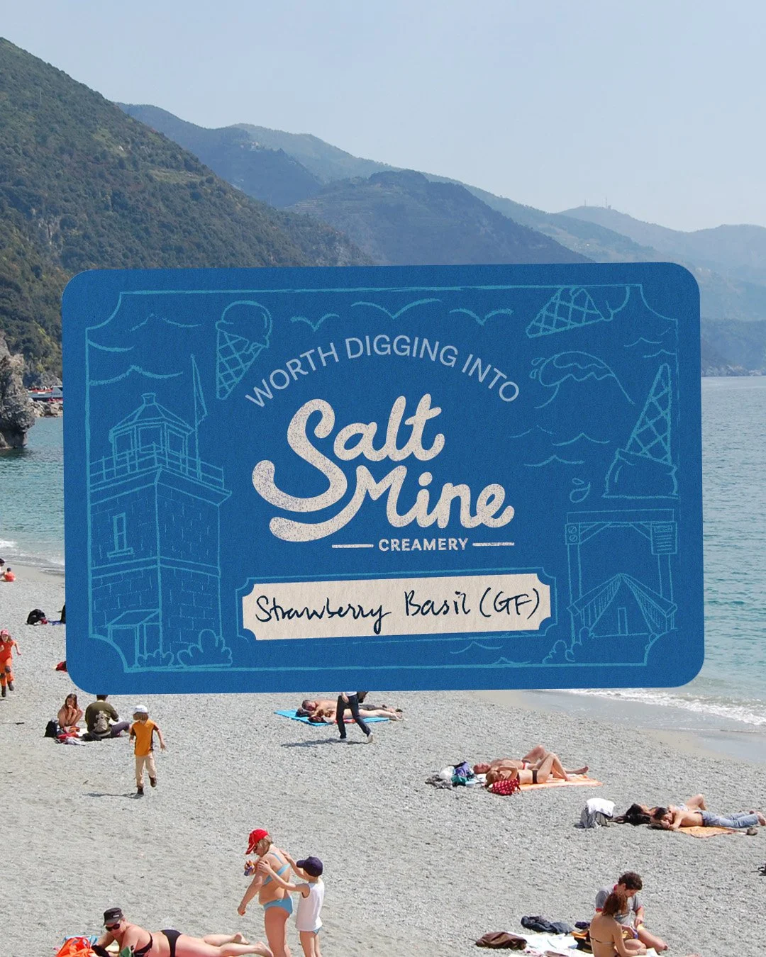

I hand-drew some of the iconic landmarks of the town and anything that was relevant to the brand and image-traced them on Illustrator. I experimented with the layout and opacity. The final design is a combination of both iterations.
PROCESS