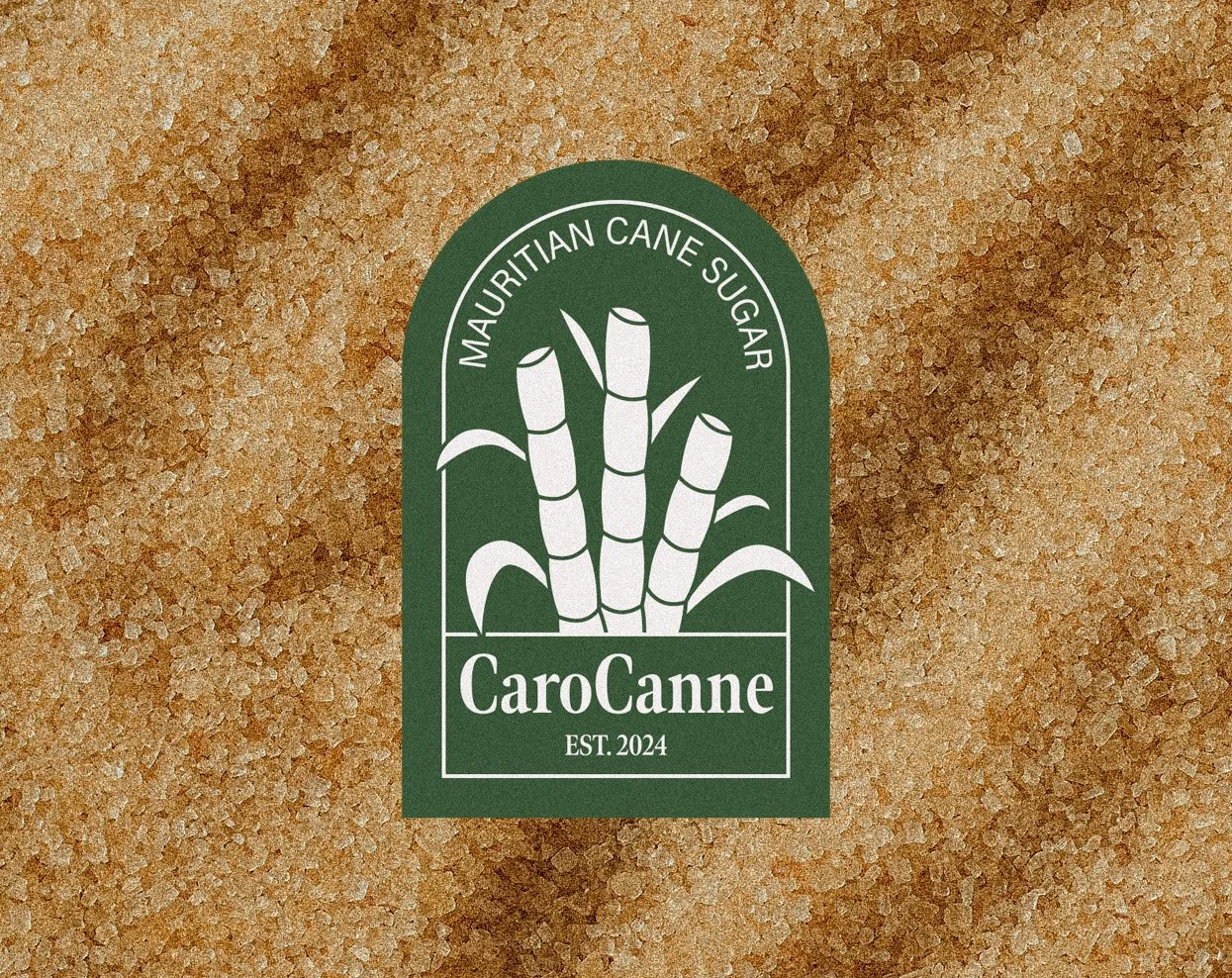
CAROCANNE
PROJECT INFO
Project Background
One of the economic pillars of the island of Mauritius is its sugar production. The island is known for its large sugar cane fields which also have historical importance. Ironically, in the past, a lot of this sugar was exported to other countries, and Mauritians mostly consume imported sugar. With the implementation of the “Made in Moris” label, more and more people are looking for locally-made products to support Mauritian companies.
Project Objectives
• To create a distinct visual branding that feels artisanal and friendly.
• To make a packaging design for Mauritian sugar targeting Mauritians.
• To design 6 social media posts for the promotion of the brand.
Target Audience
CaroCanne’s tone is artisanal and friendly. They are targeting the general adult Mauritian consumer. They buy sugar as an everyday ingredient but would like a locally made one. They are on the lookout for local products to support Mauritian companies.
Disciplines
Branding, Packaging Design, Advertising
Date
2023
Tools & Platforms
Adobe Illustrator, Photoshop, Blender
BRANDING
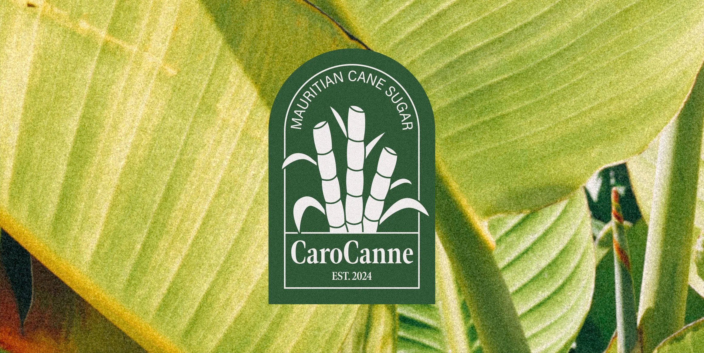
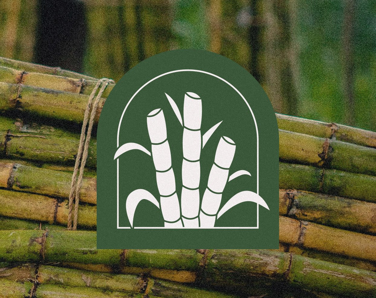
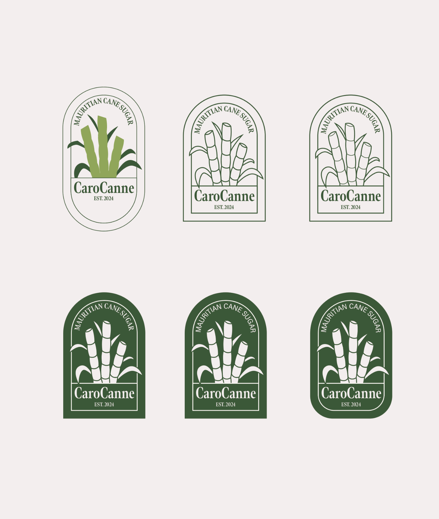
The branding for CaroCanne has a dark green as the primary colour to be reminiscent of sugar cane stalks. The lightest colour is a beige off-white to give more of a vintage and artisanal look. Instead of pure black, dark brown was used to give a slight warmth for friendliness. The logo consists of three sugar cane stalks nestled inside a tombstone shape. The sharp corners provide an established look that makes the company seem reliable.
GRAPHIC TOOLBOX

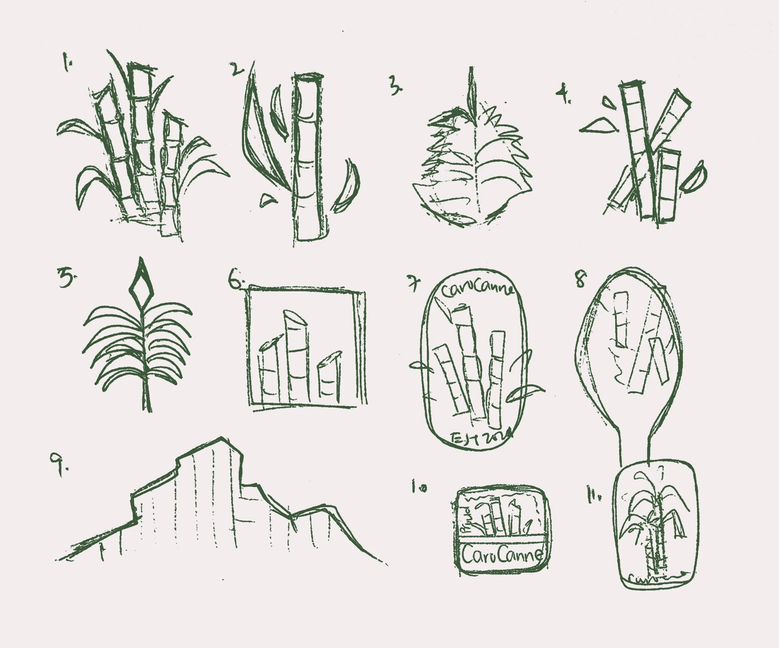
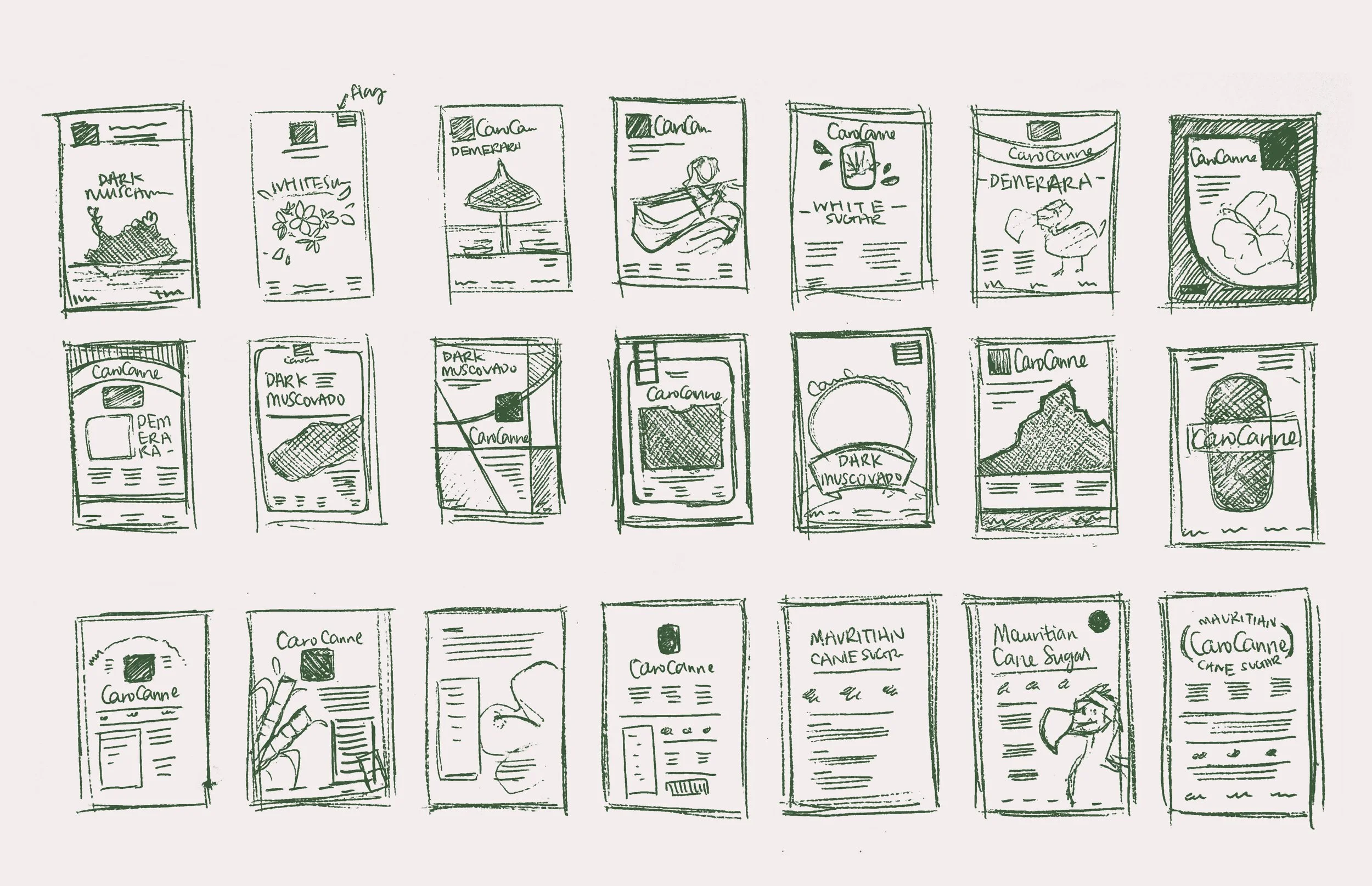
I started by sketching a few thumbnails and by looking for inspiration. I finally settled on a combination of 1 and 7.
PROCESS
PACKAGING DESIGN
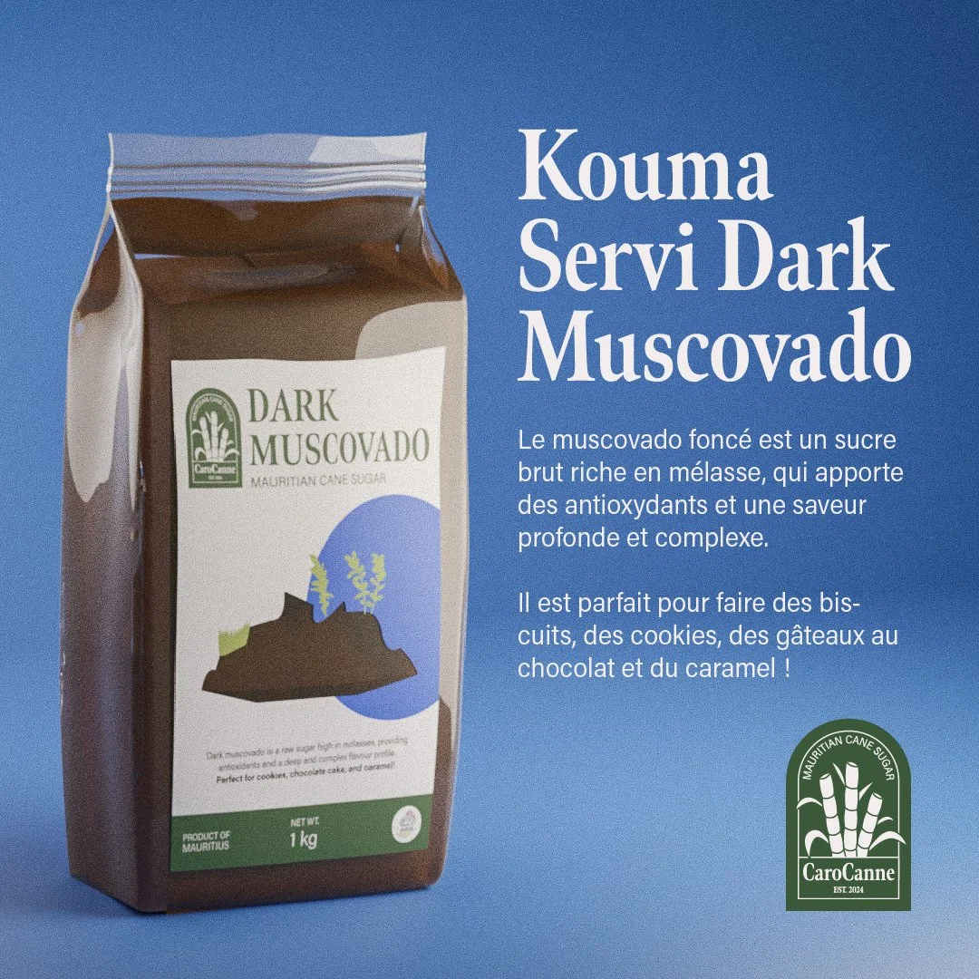
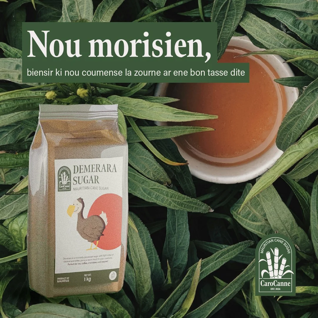
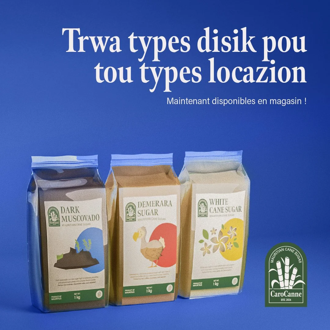
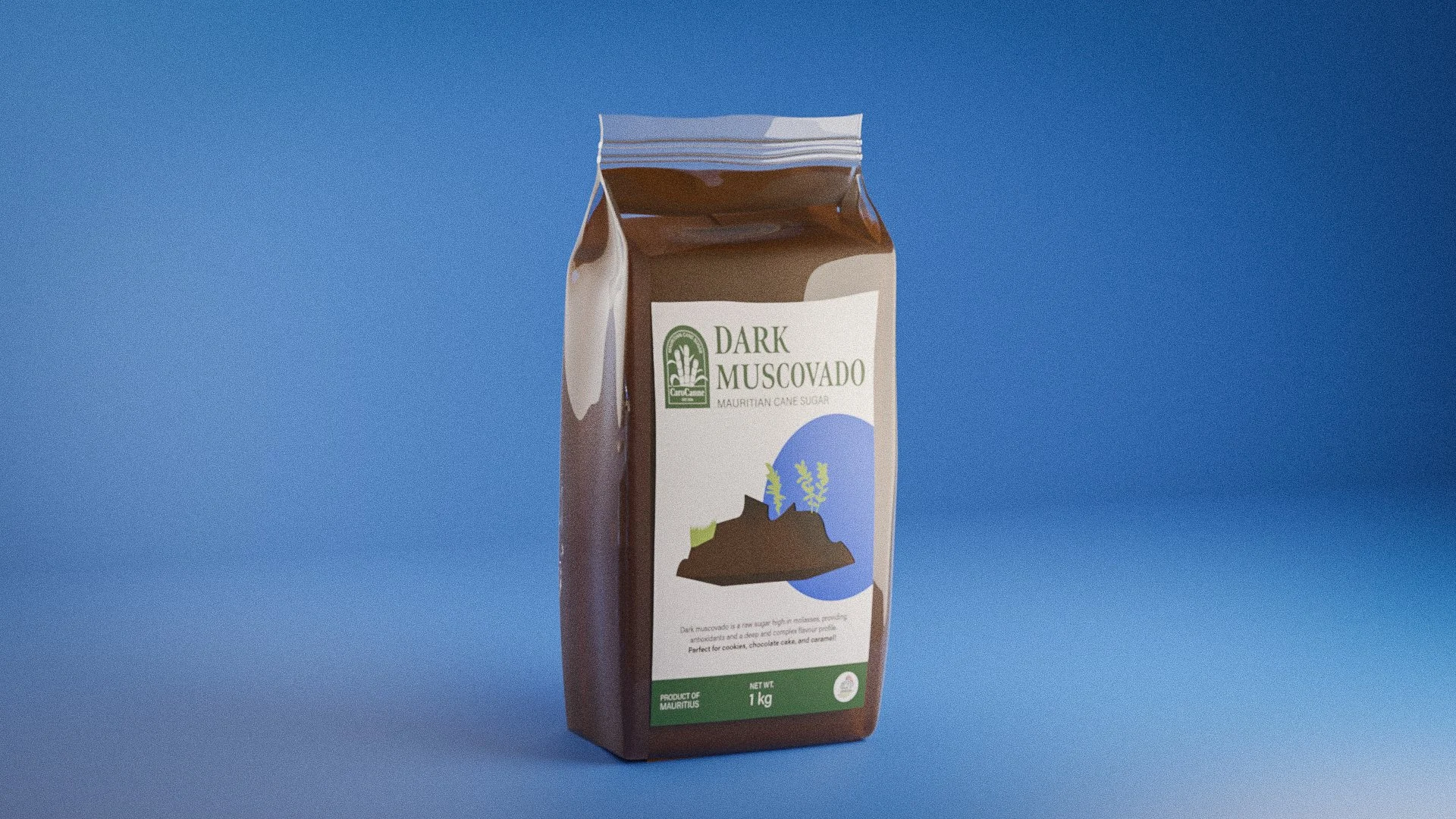
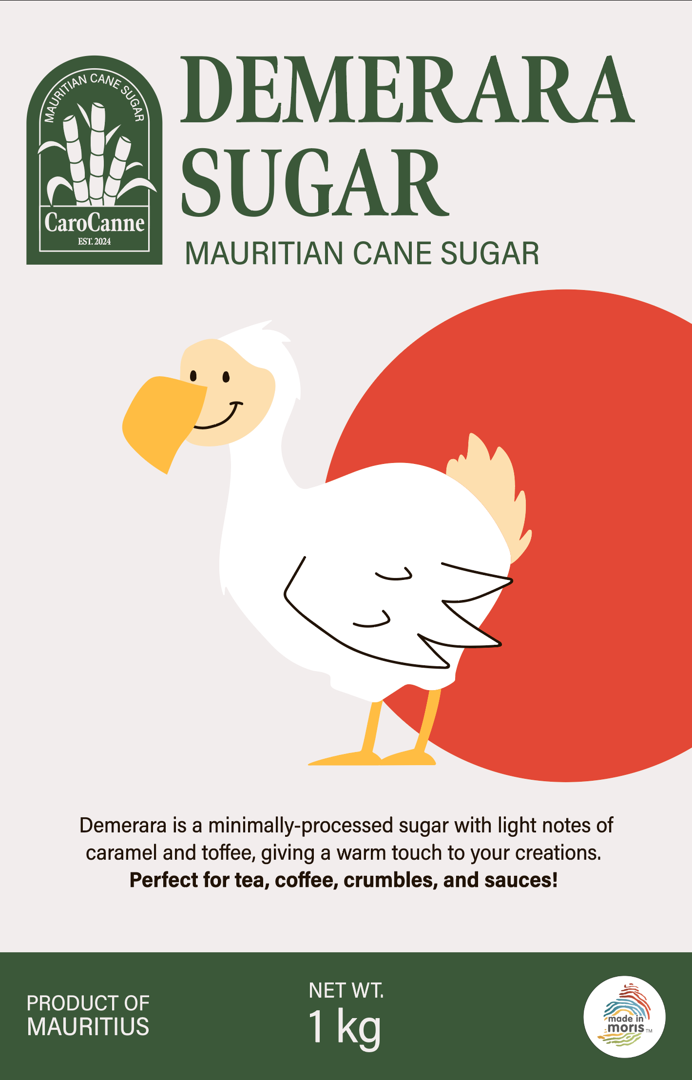
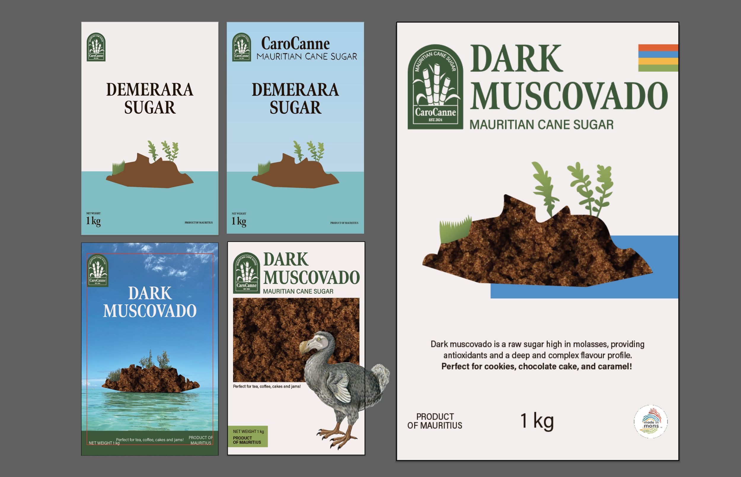
All three packaging designs consist of a window cutout that, when filled with their respective sugars, forms an image of an iconic symbol of Mauritius. The motifs have a coloured circle behind them to make them pop. Each sugar has a specific colour so customers can recognize the type easily. Together with the logo, the three packages make up the Mauritian flag colours – red, blue, yellow, and green. The green bar a the bottom balances the composition with the text-heavy top. The logo for the “Made in Moris” label has been added to certify that the sugar has been made locally. Each packaging also contains a small paragraph informing customers of the type of sugar and some suggestions for use. This is a soft call to action.
The dark muscovado sugar packaging motif is the Crystal Rock of Mauritius. It is an emblematic feature of the island and has been used repeatedly in various Mauritian media. Blue was chosen to reflect the sea and water in which the rock sits in.
DARK MUSCOVADO

The demerara packaging has the dodo bird as its motif. This famous extinct bird was indigenous to the island and is instantly recognizable by everyone.
DEMERARA SUGAR


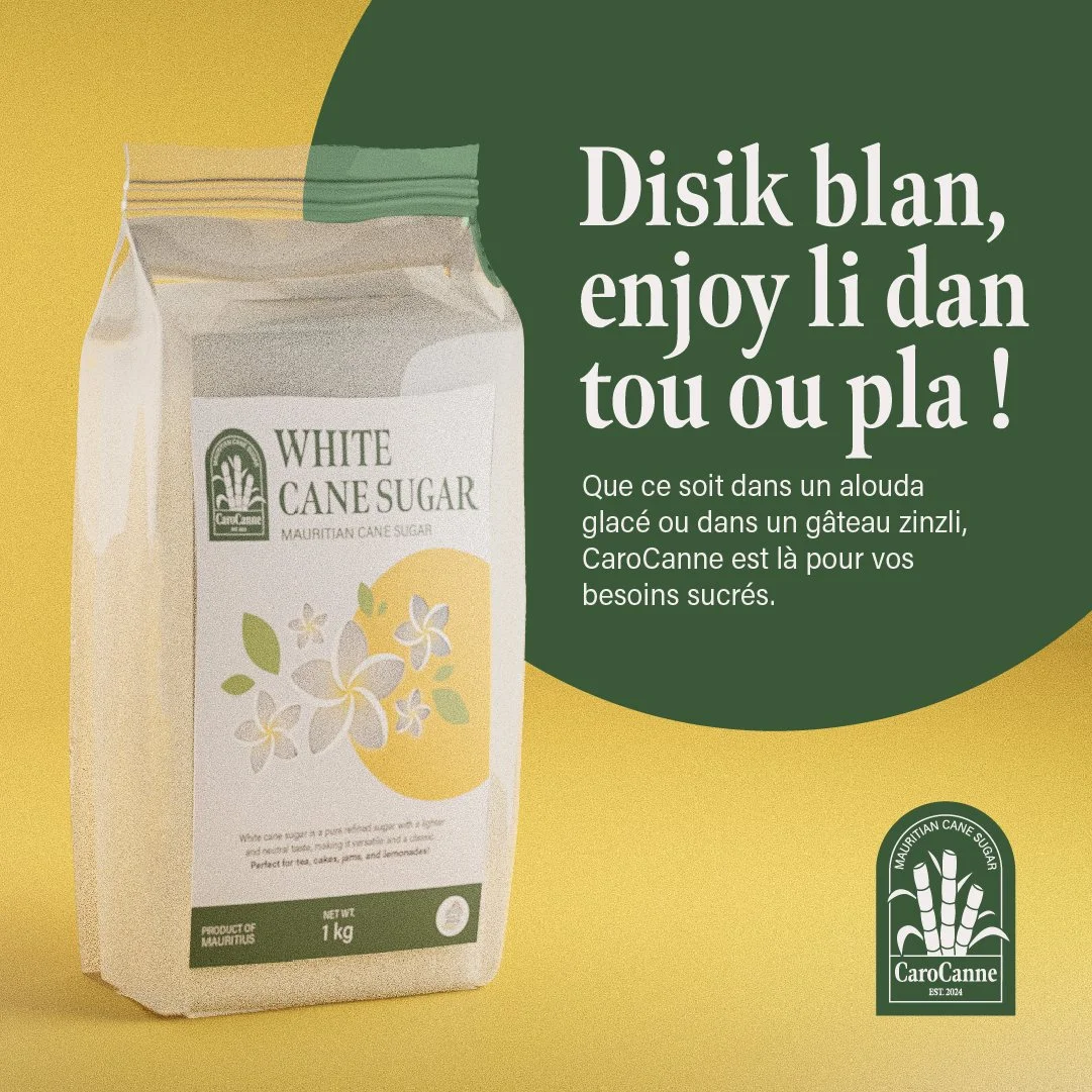
The white sugar packaging has frangipani flowers as its motif. This flower is a popular tropical one that grows in the island’s coastal regions. Yellow was chosen for the circle to echo the flowers’ cores.
WHITE SUGAR


PACKAGING LABELS


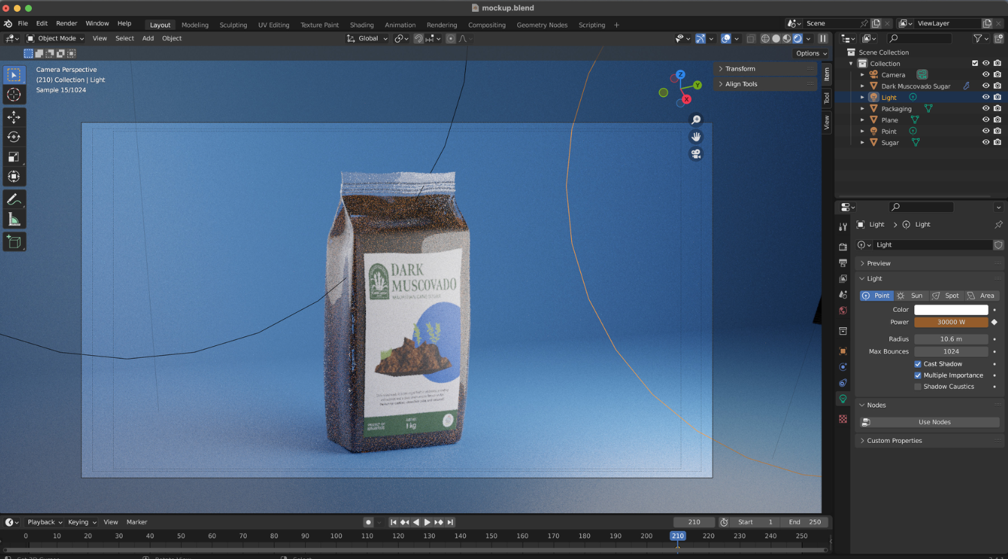
I sketched out a few thumbnails with varying compositions and emblematic Mauritian elements like Sega dancers and iconic natural features/landmarks. I then went into Illustrator to iterate the designs further. I did some research into the available packaging for sugar in Mauritius and used Blender to create the mockups for the chosen type. I wanted to challenge myself and learn how to use Blender for the first time.
PROCESS

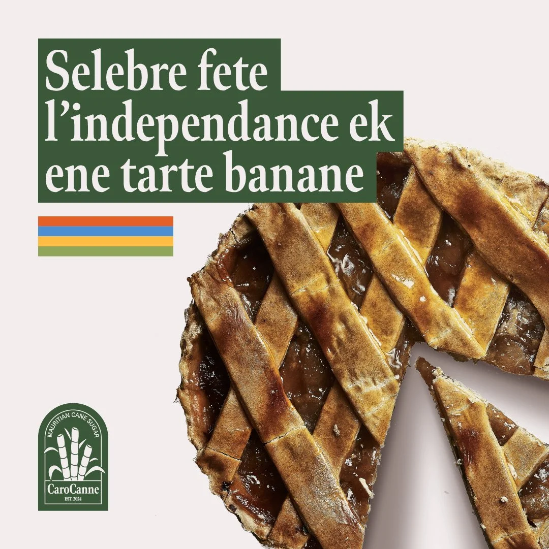
SOCIAL MEDIA POSTS
The social media posts are a mix of pure advertising, recipes, trend-hopping, and information that provides value for people who follow the page. The photos are kept colourful to reflect the vibrant culture of the island. The heading of each post is in Mauritian Creole to attract the population and be relatable to them. The smaller text is in French, as most of the population speaks it as well. CaroCanne’s logo is on every post to promote brand awareness and cohesiveness.