CAFÉ DES LILAS
PROJECT INFO
Project Background
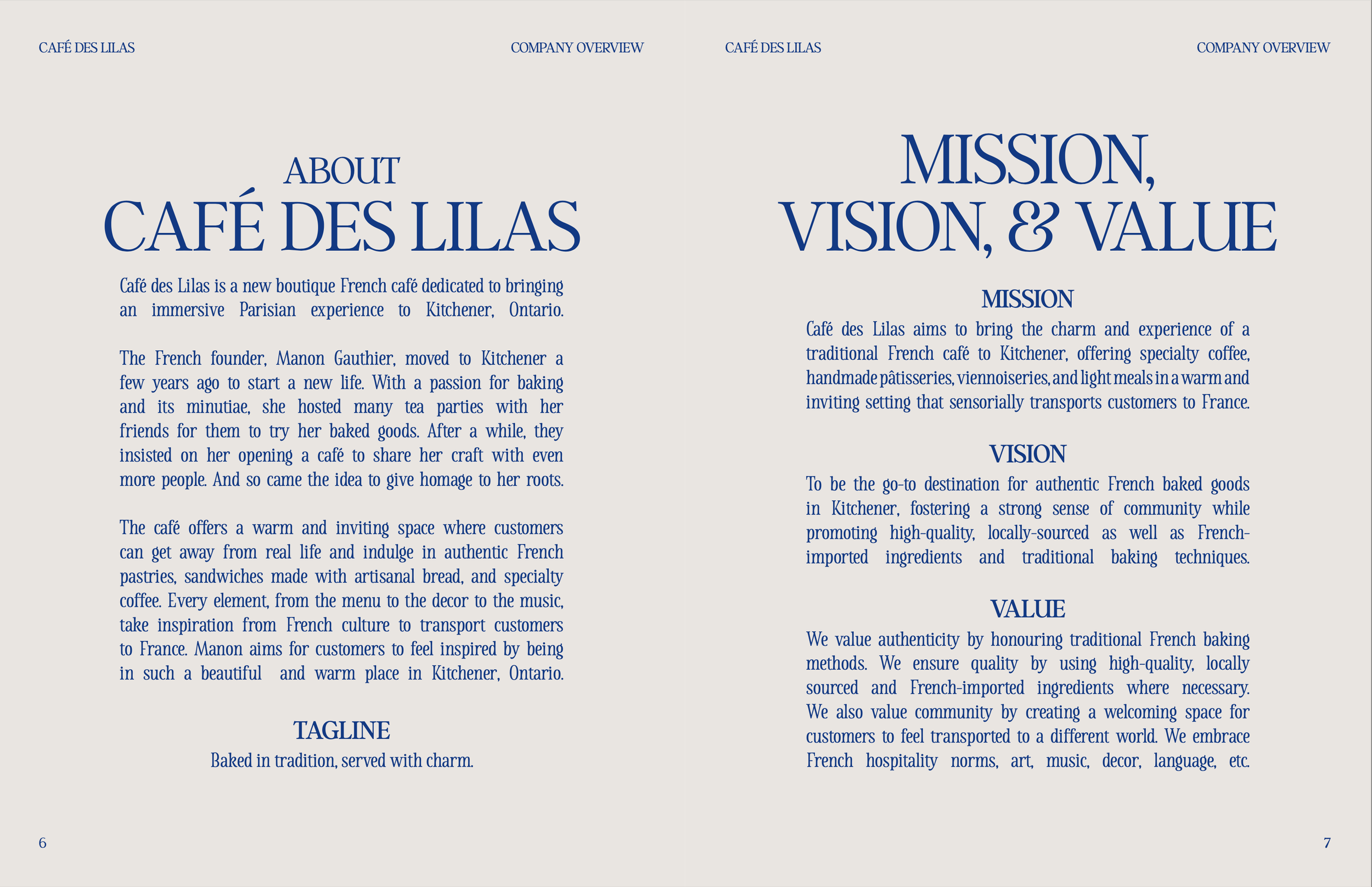
Café des Lilas is a fictional cafe that plans to open in Kitchener. It offers a warm and inviting space where customers can get away from real life and indulge in authentic French pastries, sandwiches made with artisanal bread, and specialty coffee. Every element, from the menu to the decor to the music, would take inspiration from French culture to transport customers to France. They aim for customers to feel inspired by being in such a beautiful place, targeting coffee shop enthusiasts, Francophones, and artists.
Project Objectives
To develop a cohesive visual identity and a menu design.
Problem
To be easily recognizable and establish a cohesive presence online and in person, the company needs a brand identity. There are numerous cafes in the area, and the competition is strong. The brand, therefore, needs a strong visual identity (logo and brand guidelines) and a print menu design for dining.
Disciplines
Branding, Menu Design
Date
2025
Tools & Platforms
Adobe Illustrator, InDesign, Photoshop

VISUAL IDENTITY
BRAND GUIDELINES
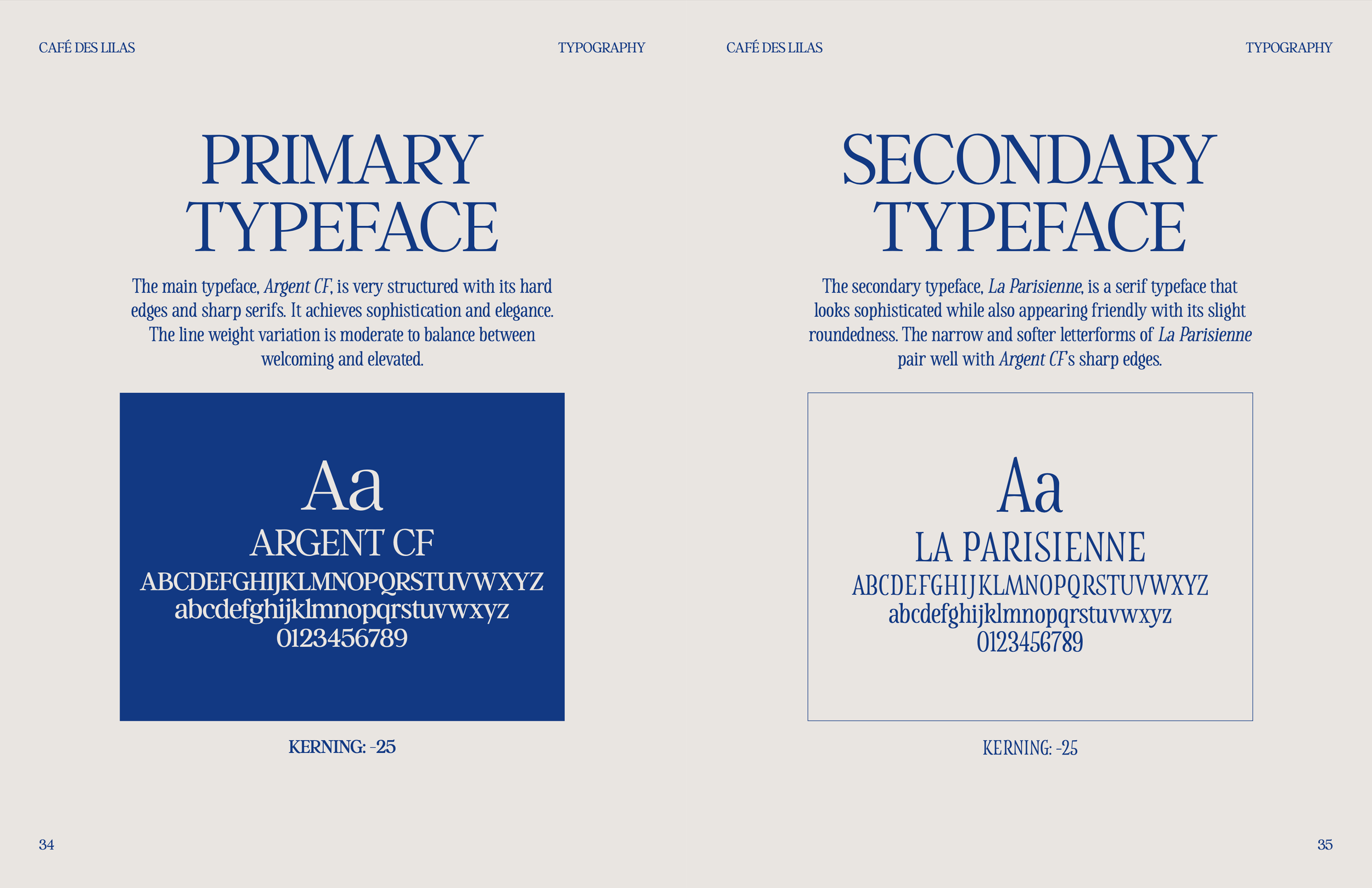
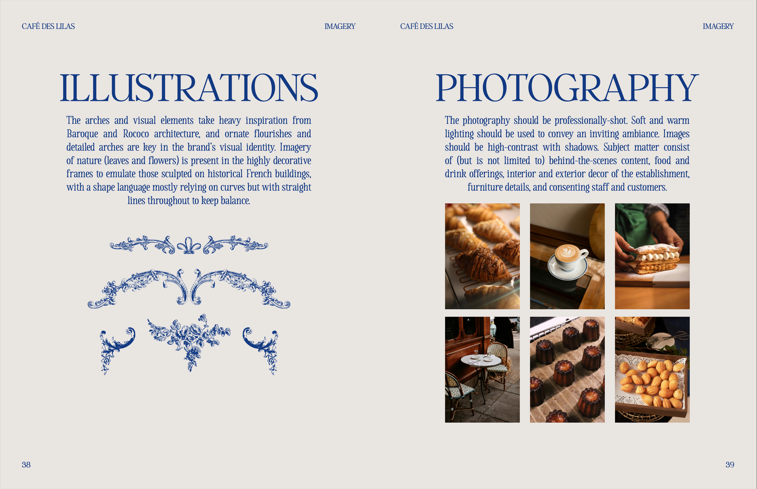
The visual identity was designed to be elegant and refined to communicate its origins and values by using Baroque- and Rococo-inspired ornamentation and floral elements. They were both sourced from the public domain and hand-drawn. The serif typography and sober colour palette further convey the brand’s essence. The symmetry throughout the visual language conveys order and harmony.


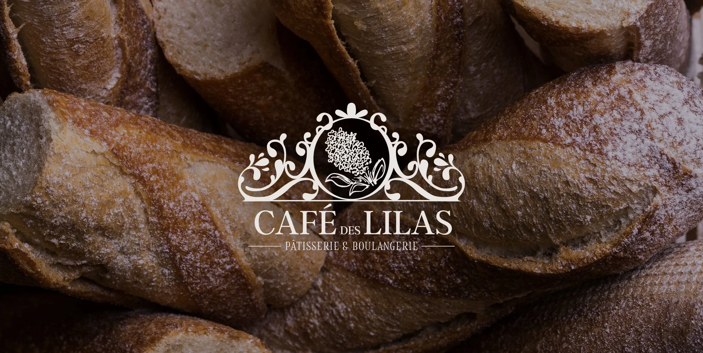
The logo makes use of symmetry to achieve a harmonious and almost regal look with its resemblance to a tiara. It consists of ornamentation and flourishes, evocative of high-quality and grandeur. The highly detailed look also speaks to its clientele.
The thick and thin strokes convey a sense of elegance. Inside the central circle is an engraved lilac bouquet to pay homage to the cafe’s name.
LOGO DESIGN


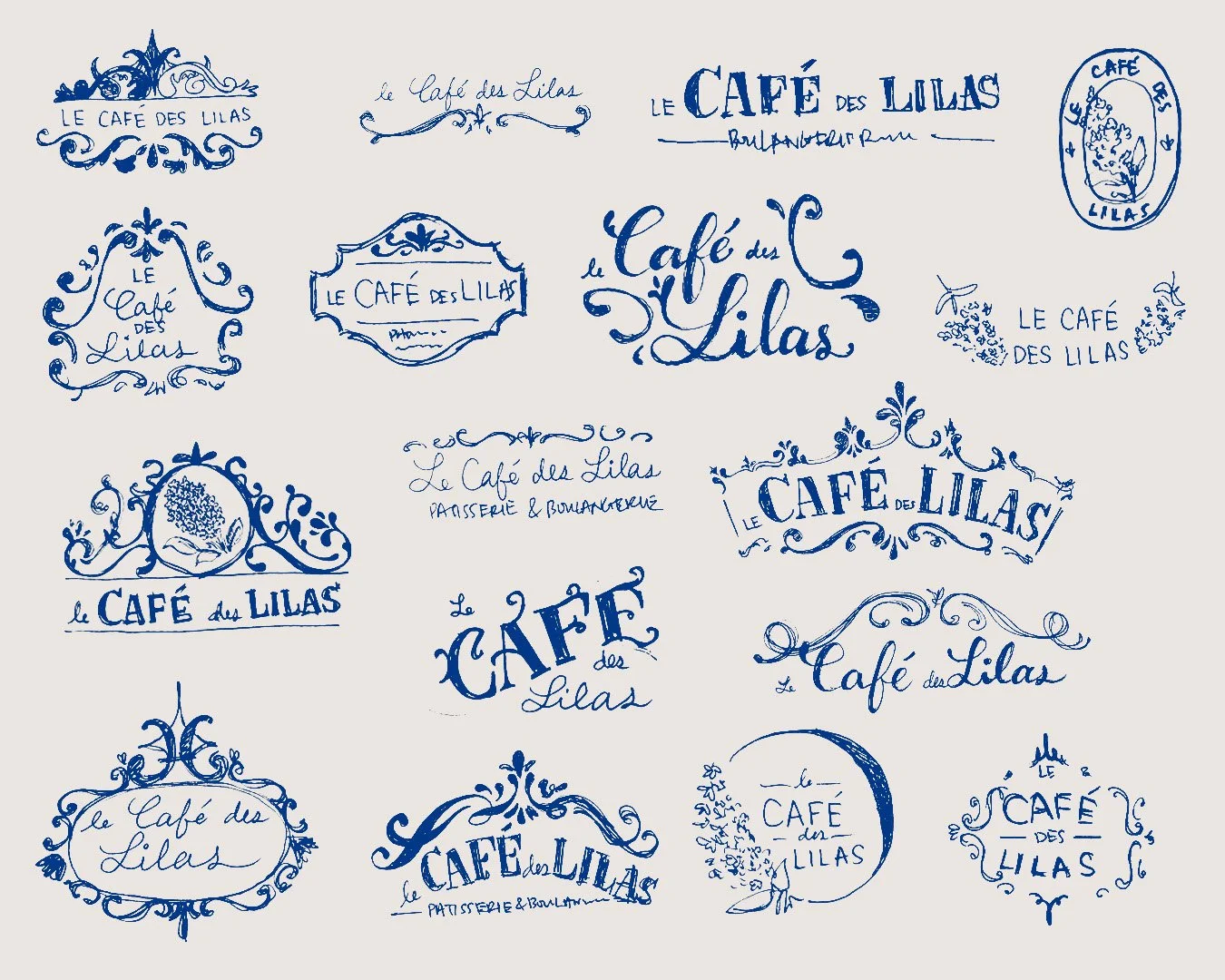
I started by sketching out crest-like logos with elegant swoops, intricate frames, and different typographic styles. I settled on three concepts for consideration with three different typefaces, colours, and systems. I looked into antique picture frames and French architectural details for inspiration.
PROCESS


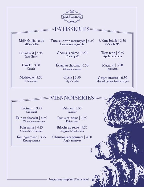
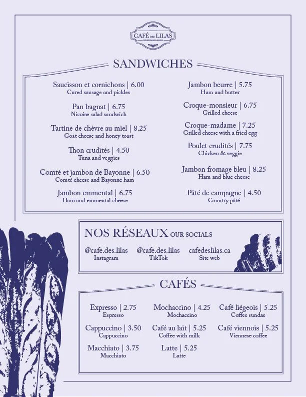
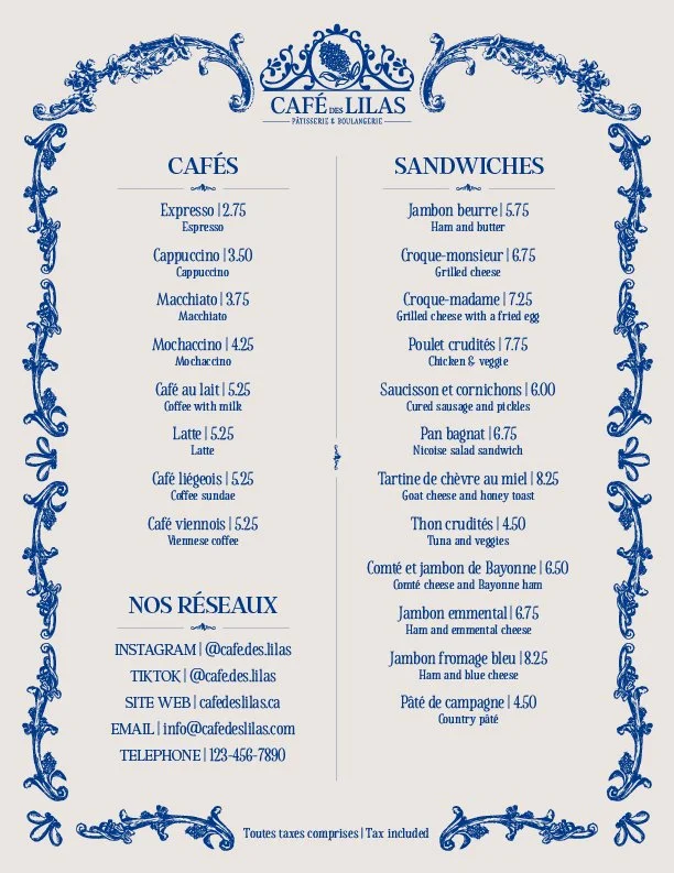
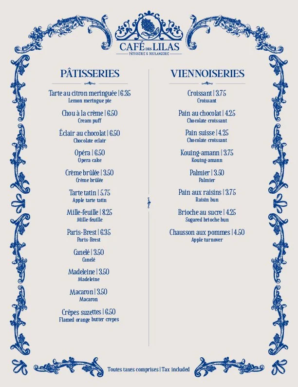
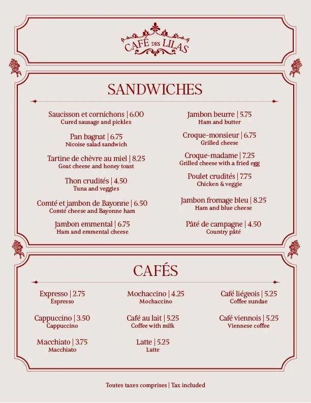
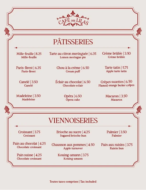
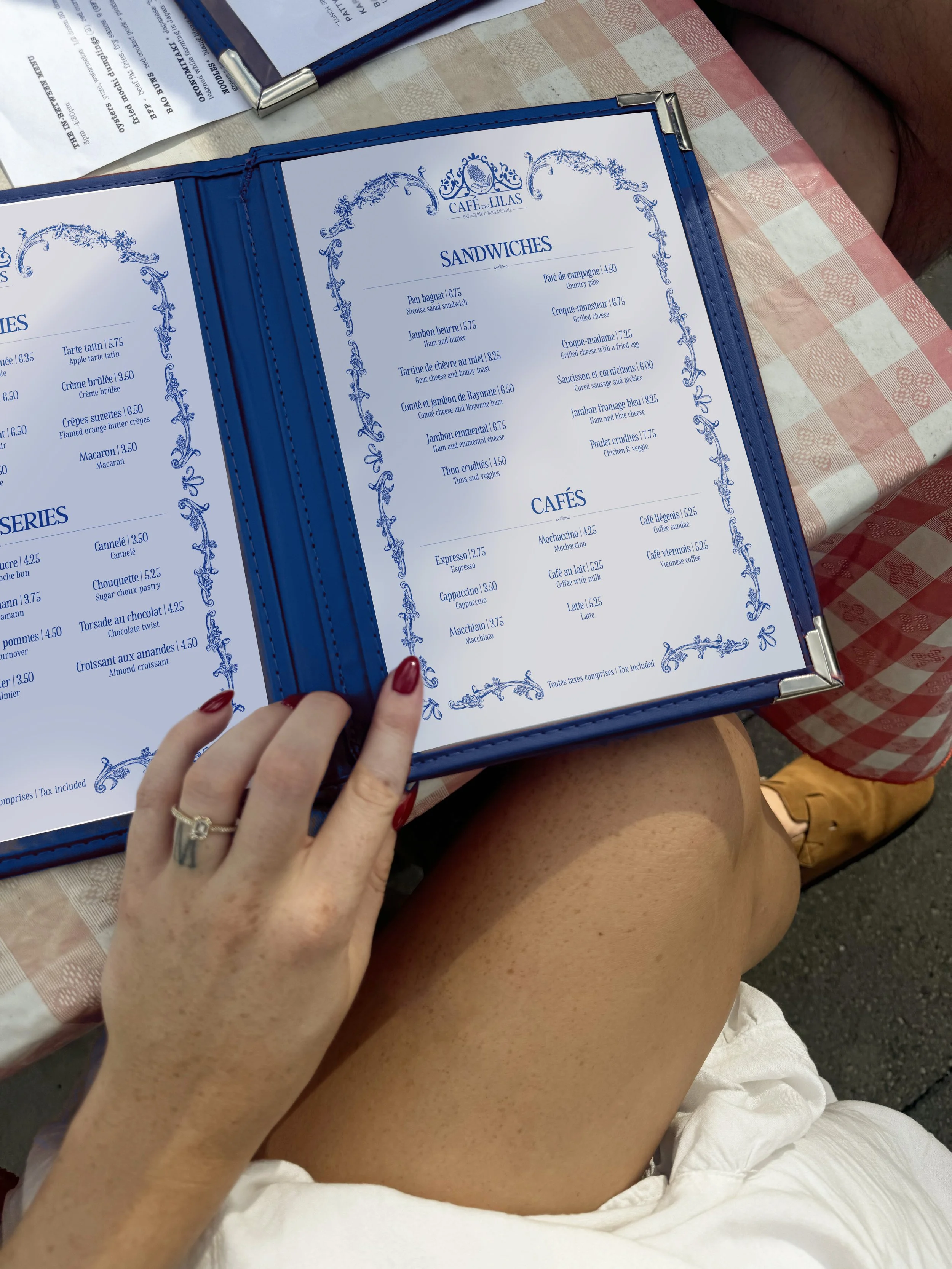
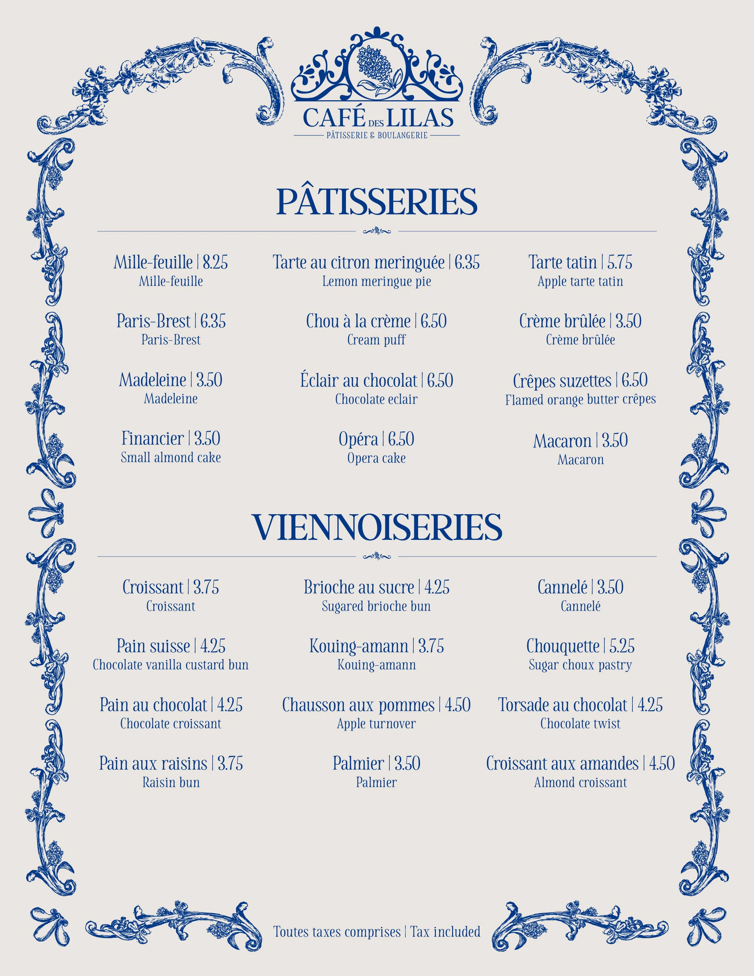
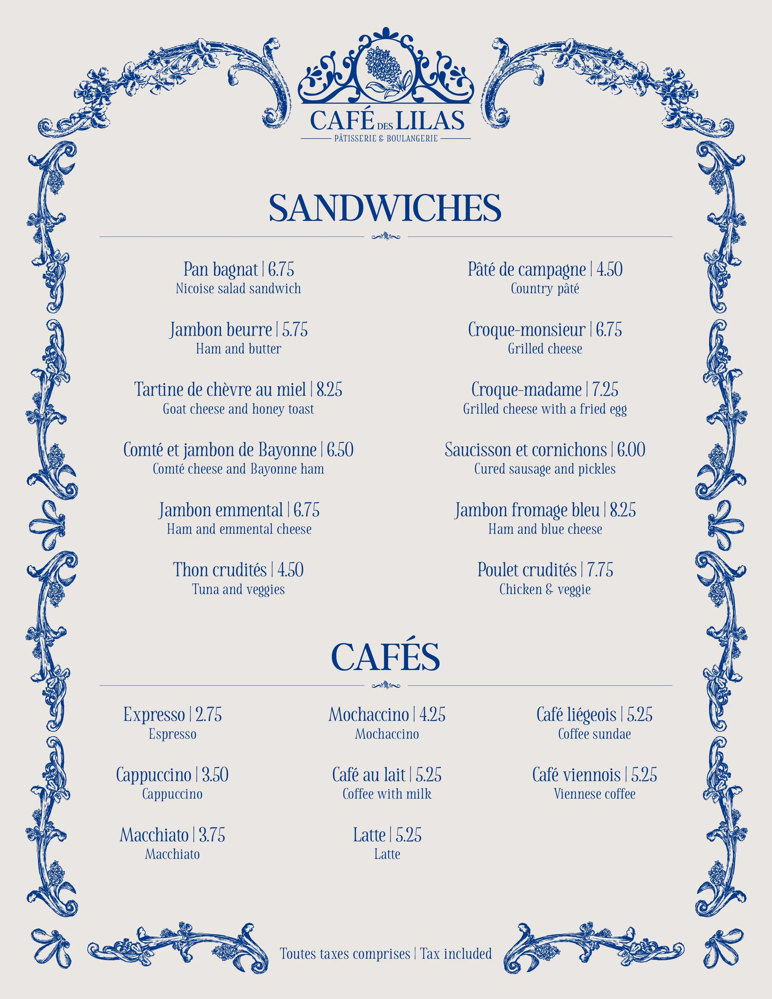
MENU DESIGN
Inspired by Baroque architecture, the menu comprises intricate arches adorned with florals and foliage that frame the entire page to echo the French branding. The menu items were laid out in such a way as to achieve the most visual harmony.
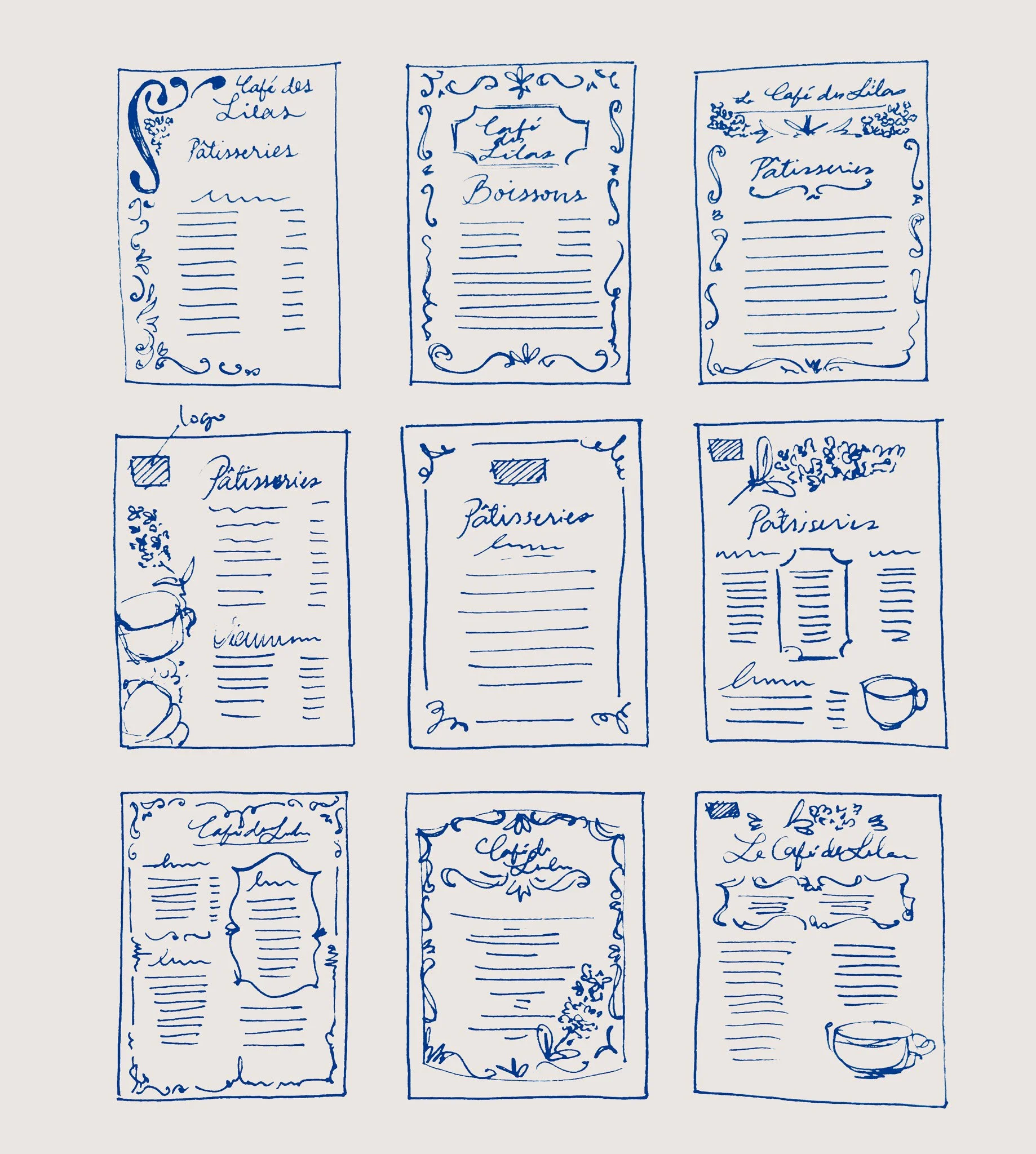
I looked for inspiration from historical menu designs of the past, sketched out some thumbnails with a more modern take, and developed three distinct designs for the three concepts. From my research, framing was a recurring element in historical layout designs with varying levels of detail and illustration.
PROCESS